glitter for me, glitter for you, a blog of .. art .. architecture .. interiors .. object design .. quotes .. glitter ..
LET THERE BE LOVE
Using 75 red linear LED pixels, each 
individually adjusted and mounted to 2.3 meter tall steel rods by hand to render the hearts image from the correct distance and angle, this art installation makes a visual statement. Let there be love from any angle. The world needs more of this. Long live art.. and love !!!  
  • Light Loves collection by GNI Projects @ Luminale, Frankfurt Germany, 2011.
THINK !!!


INTERSTITIAL SPACES
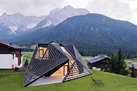
2 problems solved: a pitched roof adorn + a new home for the family of the project architect, Ulla Hell. 
The result, an innovative "skin" or covering that leads to interstitial indoor-outdoor spaces. In this project, the existing under-utilized roof space gives way to an angular crown, connected to a ground floor reception space and architectural office by the host’s renovated spine. 
Interstitial spaces between the exterior walls and 
wooden bands swell at ground level to offer sheltered outdoor living spaces. The most spectacular view of this home is a skylit corridorThis opening delivers an immediate reading of exterior weather conditions, 
collecting precipitation and receiving direct sunlight.  

  • Paramount Alma / Plasma Studio by Ulla Hell,Eva Castro, Holger Kehne @ South Tyrol, Italy 2012.

"WHEN YOU POSSESS LIGHT WITHIN, YOU SEE IT EXTERNALLY."  -ANAIS NIN
LIGHTS WITHIN
A sober minimalistic lighting approach is presented to you here in the interiors of this small Olympic Hall where custom-made, minimal suspended lighting systems welcome the visitors. A sort of blue-purple ambiance is created thanks to the light surface materials, the concrete which is partially painted in original “Olympic” colors & a black screened floor.  The suspended lighting system consists of dimmable T5s, housed in a highly polished aluminum profile. Interesting, uuh..?
Yet, what's really alluring about this lighting design is how it changes from parallelism into a more free arrangement. The arbitrariness of the lamps gives a futuristic touch which adds volume and sensation. Colors and different daylight conditions are being reflected in the polished profiles, depending on the position of the viewer.
  • Lighting design in Small Olympic Hall by Pfarré Lighting Gesign @ Munich, Germany. 2011.  

     
1,2,3,4.. SEAT IN COLOR
What about sitting on a colored surface with colors that you choose? Well, this chair is made up of four segments of wood, two for the back and two for the seat, meaning it can easily be taken apart and reassembled in different color combinations. Since the chair can be acquired in multiple colors and is so easy to disassemble and reassemble people will be capable for creating their own hybrid designs by recombining their colors of choice. 
Good work..color is life !!!
 
 
  • Moulded Plywood Chair by KiBiSi, 2010 @ Shangai Expo.
COLOR + GEOMETRY
Dare to bring color into a monochromatic space with a bold geometric shape placed in the wall like this interior view. A blue polygon clearly makes the space more funky & juvenile with the mix of raw concrete on the wall in contrast with the polished floor. Dare to be bold & different yet simple with your interiors !!! 


ALL ABOUT COLORS !!
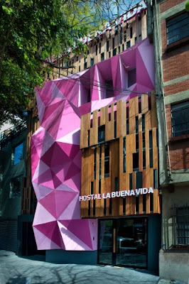
Filled with color and texture, here's a hostel located in one of my favorites sectors in Mexico City, La Condesa. An eye catcher for the contemporary urban traveler with a pink double skin facade, the hostel La Buena Vida does stand out from it's neighboring buildings.
Inside, the surprises keep visitors intrigued. The colors yellow, blue and predominantly "mexican pink" plus graphic skulls in the walls integrate the mexican tradition into the spatial experience of the hostel. Would love to stay here and drink a michelada with lots of hot sauce looking at the city view from the terrace. Maybe i will, when I visit Mexico City again.
  •   Hostal La Buena Vida (The Good Life Hostel) @ La Condesa, Mexico City by ARCO Arquitectura Contemporánea, 2011.
"THE DETAILS ARE NOT THE DETAILS, THEY MAKE THE DESIGN." -CHARLES EAMES
CUT & FOLD
Icosidodecahedrons.. yupp, yupp, that's exactly the word i was looking for. This diamond looking ornaments are easy to make with a "cut & fold" method. Choose any color or size you like and you have a conversation piece made out of paper for an important area. Simple, economic and most of all: FUN !!  
  • Chroma Lab: DIY Geometric Paper Ornaments 
THE SAIL HOUSE
A distorted, amorphous, very interesting "sail" inspired volume emerges as a small residence called K House in Japan. With the site being a steep slanting slope, nature nearby and feeling of the town close were the clients aspirations to integrate into the design. From a practical point of view, the cliff also inspired the form based on what the client wanted. For the firm a "sail" was used as the main concept to create both spacial impact and form. Talk about poetry, uuh ? 

  • K House @ Japan by D.I.G Architects, 2012. 

 
+ + + ENERGY
This is a different & dynamic approach for a Centre for Sustainable Energy Technologies, wouldn't you think so? It's facade talks about movement and energy as it folds all around. The building is entirely clad with a double skin, and inner envelope of concrete and an outer envelope of glass. The main focus of this CSET located in Ningbo, China is the diffusion of sustainable technologies such as solar power, photovoltaic energy, wind power etc... Innovative !! 
  • Centre for Sustainable Energy Technologies @ Ningbo China by Mario Cucinella Architects, 2008. 


PENTAGONS & MORE
Inspired by simple geometric shapes and curious textures, this is a funky way to organize/decorate your space. Made of 100% recycled cardboard, specifically die-cut from e-flute cardboard, shipped flat, & have an adhesive-free assembly. You cluster the pentagons the way you want for your particular purpose. Who doesn't love that type of freedom?
  • http://www.ampersandbrand.com/wallpockets.html

" AND ABOVE ALL WATCH WITH GLITTERING EYES THE WHOLE WORLD AROUND YOU BECAUSE THE GREATEST SECRETS ARE HIDDEN IN THE MOST UNLIKELY PLACES. THOSE WHO DON'T BELIEVE IN MAGIC, WILL NEVER FIND IT. 
-ROALD DAHL 

LIGHT ME INSIDE
Lot 176 is a residence with a carved out two story volume in the centre to allow light and ventilation to all interior spaces. The carved interior  provides an internal focus visually and functionally. It is largely opened on the short access to allow views out of site with the living level utilising sliding screens to opening the interior completely to the exterior. 
In this house, light and the immediate landscape transform into  invite guests with the use of wood panels, as they enter through. The inside and outside are united by seamless transitions and the consistent use of a restrained palette of materials: timber, zinc and self-finished oxide renders.
  • Lot 176, Elysium by Richard Kirk Architect @ Noosa, Sunshine Coast, Queensland, Australia
DISCO, DISCO, DISCO
Light has become an increasing source of inspiration for artists, designers and product developers, who are harnessing cutting-edge scientific and technological developments to produce amazing results. Like this chair, strung with 200 meters of electroluminescent wire to shine, when powered, in a rainbow of color. It can also be switched to a flash/pulse mode for a disco-style lighting effect. Makes me feel like dancing disco around it welcoming you to the future.. 
  • Disco Chair by Kiwi & Pom, July 2010.